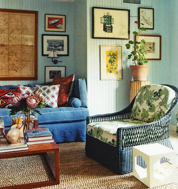

I think this Peter Dunham room above is divine. I love the wall colour. I love the mismatched artwork on the walls. I love the coffee table. I love the sisal rug which I feel grounds the room beautifully and I love the fresh pink Peonies placed on the coffee table.
It looks like Peter may have done a little redecorating when you compare the above photos of his room to the below photos.
Designers are always tempted by the most beautiful new ranges of fabrics and wallpapers. I know myself when I see a fabric in a new collection I can't live without I have a few cushions made in it for my sofa at home. I suppose for me, that's the wonderful thing about having a white sofa as it is so interchangeable.
Designers are always tempted by the most beautiful new ranges of fabrics and wallpapers. I know myself when I see a fabric in a new collection I can't live without I have a few cushions made in it for my sofa at home. I suppose for me, that's the wonderful thing about having a white sofa as it is so interchangeable.
Which way do you prefer Peter's room? The first way as above or the second way as below?

